- "Practical Magic" by Alice Hoffman
- "The Art of Writing" by Lajos Egri
- "The Art of Pixar" by Amid Amidi
- "Lolita" by Vladimir Nabokov
- "Baby's In Black" by Arne Bellstorf
- "A Twist Of Lennon" by Cynthia Lennon
- "The Fifth Beatle" by Vivek J. Tiwary
- "Wonderful Tonight" by Patti Boyd with Penny Junor
- "Vincent And Theo" by Deborah Heiligman
- "The Virgin Suicides" by Jeffrey Eugenides
- "Best State Ever: A Florida Man Defends His Homeland" by Dave Barry
- "Carlin Home Companion: Growing Up With George" by Kelly Carlin
Sunday, April 30, 2017
Assignment 16: Final Evaluation Conference
Books I'd Love to Read In The Future:
Thursday, April 20, 2017
Assignment 15: McLuhan And Media Future
 |
| My Illumination Page, based on "The Medium is the Massage: An Inventory of Effects" by Marshall McLuhan. Photography & Art belongs to Natalie A Palumbo. |
Monday, April 17, 2017
Assignment 14: Review Of "Look Out, The Saints Are Coming Through"
What is your reaction to the text you just read?
My reaction to “Look Out, The Saints Are Coming Through” from The Daily Beast is rather mixed. Personally, I would have preferred if the characters were identified by name as opposed to simply “he” and “she”. I appreciated the discussions about Bob Dylan between the two characters, but this story seemed to flash forward and back with no context to support where we were at any given time. As curious as I was about what happened to the two characters bonding over Bob Dylan, I couldn't help but be confused with all the additional of information eluding to a possible tragedy and related victims.
What also perplexed me was the insertion of social media, Instagram, used primarily for visual art, photography, or short videos. I had expected the story to be set in the 1960’s-1970’s due to the references to Bob Dylan. Mentioning social media removes the timeless element (cementing it to Instagram), as well as weaken the sense of immersion the author might have achieved had it been set in the past.
This short story had interesting aspects to it. Descriptions of the characters are expansive so the reader understands their motivations. The author makes clever use of comparisons to Bob Dylan lyrics to illuminate characters from an emotional standpoint. For example, the author references the male's favorite song as “Subterranean Homesick Blues” (about the frustrations of youth) only to have it replaced with “She Belongs to Me” (about an enchanting artist content with her life). He expresses the desire to a musician, like Dylan, and is longing to find “his artist.”
Despite the clever use of caparison, the story still felt like a steady stream of consciousness that jumped from subject to subject without an anchor to connect all the scenes together. The two main characters naturally have flaws, but there doesn’t seem to be any growth between the two while they air their criticisms about life, politics, and other people. I would have appreciated if the story was broke into cohesive pieces instead of being all mixed together. I would have preferred separate chapters so the reader isn’t confused about where they are at any given moment within the story.
What connections did you make with the story? Discuss the elements of the work with which you were able to connect?
I could identify with the woman using the encouraging lyrics to “She Belongs To Me” for strength and motivation. I could also appreciate her bonding with someone over musician, Bob Dylan. In my own life, the rock music I love most spans many decades, and is my favorite because it endures. However, I would have preferred to hear more about the highly praised critic she knew from Yale rather than the “sudden attack” and “tragedy” of a seemingly unrelated plot.
I did think the author skillfully described the emotional reactions of each character, especially how they are perceived by one another. While it seems to be a steady stream of consciousness (which can be confusing), the author was “showing us” instead of “telling us” what was occurring, which allows the reader to visualize details while the story is revealed.
What changes would you make to adapt this story into another medium? What medium would you use? What changes would you make?
I would separate each of the smaller plots into self contained stories as opposed to being blended without a sense of timeline. If I were to adapt this story to a medium, I might choose an episodic series solely because you can gradually evolve the characters and their personal growth in each episode. Then, you could lead up to the climactic “tragedy” and show the aftermath. I would also give names to the characters so they're easier to identify rather than guessing who is who. Audience concern and investment in the story is stronger if the viewer can bond to the characters.
Since this is heavily inspired by the legendary Bob Dylan, his music should be implemented, as well as other musicians influenced by Dylan from that period. I would also remove any references to social media and search engines so the story can remain timeless and relatable beyond the current time-frame. “You've Got Mail,” starring Tom Hanks and Meg Ryan, sports the usual romantic comedy charm. However, the film references “AOL” and this “new thing called email” to such an excessive degree, it dates the film. I would keep the story relatable without such direct references. Longing and regret are human, and bonding over legendary art is timeless.
Sunday, April 16, 2017
Assignment 13: Curate Yourself
“33 1/3 Rotations Per Minute” – An Exhibition of Surrealist Album Art From The Vinyl Rock Era.
This curated exhibition celebrates surrealistic album cover art from the 60's and 70's vinyl rock era, and the creative inspirations of designers. The aim of the surrealist movement was to, "Resolve the previously contradictory conditions of dream and reality.”Surrealism grew from the Dada movement during World War I, and spread internationally to influence film, music, and visual art spanning across cultures, languages, politics, and social and philosophical theories. Surrealist art creates the element of surprise through the juxtaposition of seemingly unrelated visuals as an expression of the human condition through suggestive dream imagery.
These cover illustrations explored the subconscious minds of the musicians as expressed through the conceptual ideas of the illustrators. According to André Breton, a leader of the surrealist movement, surrealism was, “A revolutionary movement, above all else.” The art inspired by the vinyl rock era represents artifacts of this philosophical movement.

Tommy
Band: The WhoAlbum Artists: Mike McInneryney & Barrie Meller
Year: 1969
Genre: Hard Rock, Rock.
“Tommy” was conceived by guitarist, Pete Townshend, as a “rock opera” about a boy who is rendered deaf, dumb, and blind through a trauma, and his vulnerable relationship with his erratic family. Townshend was heavily influenced by the spiritual teachings of Meher Baba, and tried to translate his teachings into musical form.
Townshend recruited designer, Mike McInneryney, who was a fellow follower of Baba’s teachings. McInneryney wanted to portray a world seen through the eyes of a boy limited by his external senses. He chose to, “Depict a kind of breaking out of a certain restricted plane into freedom."
The cover shows a blue and white “web” of clouds with a fist punching through the black void. The Who's Co-Manager, Kit Lambert, approved of the design on behalf of Townshend, who was busy in the recording studio at the time of presentation. The only change to the design was to include images of the band members in the holes of the web at the request of their record label.

Layla And Other Assorted Love Songs
Band: Derek And The DominoesAlbum Artist: Emile Théodore Frandsen de Schomberg
Year: 1970
Genre: Blues Rock
Eric Clapton requested that the front cover for “Layla And Other Assorted Love Songs” be a reproduction of a painting by Emile Théodore Frandsen de Shomberg entitled “La Fille Au Bouquet,”or “The Girl With The Bouquet.” Clapton saw this painting in the south of France at the house of Giorgio Gomelsky. Clapton spotted a likeness between the girl in painting and Patti Boyd, for whom “Layla” had been written. He insisted the painting represent the album without any additional text to identify the band name or title.

In Search Of The Lost Chord
Band: The Moody BluesAlbum Artist: Phil Travers
Year: 1968
Genre: Progressive Rock, Psychedelic Rock
Phil Travers worked in the art department at Decca records when he was asked to create a cover for “In The Search Of The Lost Chord”. The Moody Blues shared their recordings with Travers so he could design with the music in mind.
The directive from the band was to portray an abstraction of “meditation.” Travers found this difficult initially (having never experienced meditation), until he remembered seeing a multiple reflection of himself in the audio suite glass separating the recording and mixing stations. Travers used gouache, watercolor, and airbrushing to create the radiant visuals. Travers would continue to create album art for the Moody Blues, and his style would become synonymous with the band's albums of the 1970’s.

Days Of Future Passed
Band: The Moody BluesAlbum Artist: David Anstey
Year: 1967
Genre: Proto-Prog, Art Rock, Progressive Rock, Psychedelic Rock, Symphonic Rock.
The album art for “Days Of Future Passed” is fondly remembered for its brightly colored imagery. Originally created by David Anstey, the imagery was meant to represent a musical “cycle of life” that blends psychedelic pop and classical music together.
Anstey’s illustrated cover in 1967 would set the precedent for Moody Blues album covers to feature complex surreal imagery that was both thematically cohesive and visually subjective. The meanings are still debated as to what the imagery definitively represents.

Revolver
Band: The BeatlesAlbum Artist: Klaus Voormann
Year: 1966
Genre: Rock, Pop, Psychedelic Rock
The album cover for The Beatles “Revolver” was designed by Graphic Designer Klaus Voormann. He met the Beatles in 1962 along with photographer, Astrid Kircherr, who took the (now famous) black and white photography of The Beatles during their club band days in Hamburg, Germany. Voormann's initial concept for Revolver was to create a “scrapbook collage” by mixing illustrations with photographs for a mixed media piece. Revolver was influential in the rise of rock subgenres such as psychedelic, electronica, progressive, and world music. The cover won the 1967 Grammy for Best Album Art. Voormann would later design art for George Harrison’s 1988 single “When We Was Fab” which included the image of Harrison from Revolver along with an updated illustration in the same scrapbook style.

On the Threshold Of A Dream
Band: The Moody BluesAlbum Artist: Phil Travers
Year: 1969
Genre: Progressive Rock
After designing cover art for the Moody Blues album “In Search Of The Lost Chord,” Phil Travers was asked to create the cover for “On The Threshold Of A Dream.”
Travers created a rough pencil sketch while listening to the recordings. The cover painting is meant to depict our ambitions, sometimes left unrealized, as projected in our dreams. Travers began painting once the band greenlit the original sketch design. Due to the intricate detailing, Travers would frequently pull all-nighters in order to meet project deadlines. Despite being under intense pressure, Travers found the experience artistically fulfilling, and reflects on the period fondly.
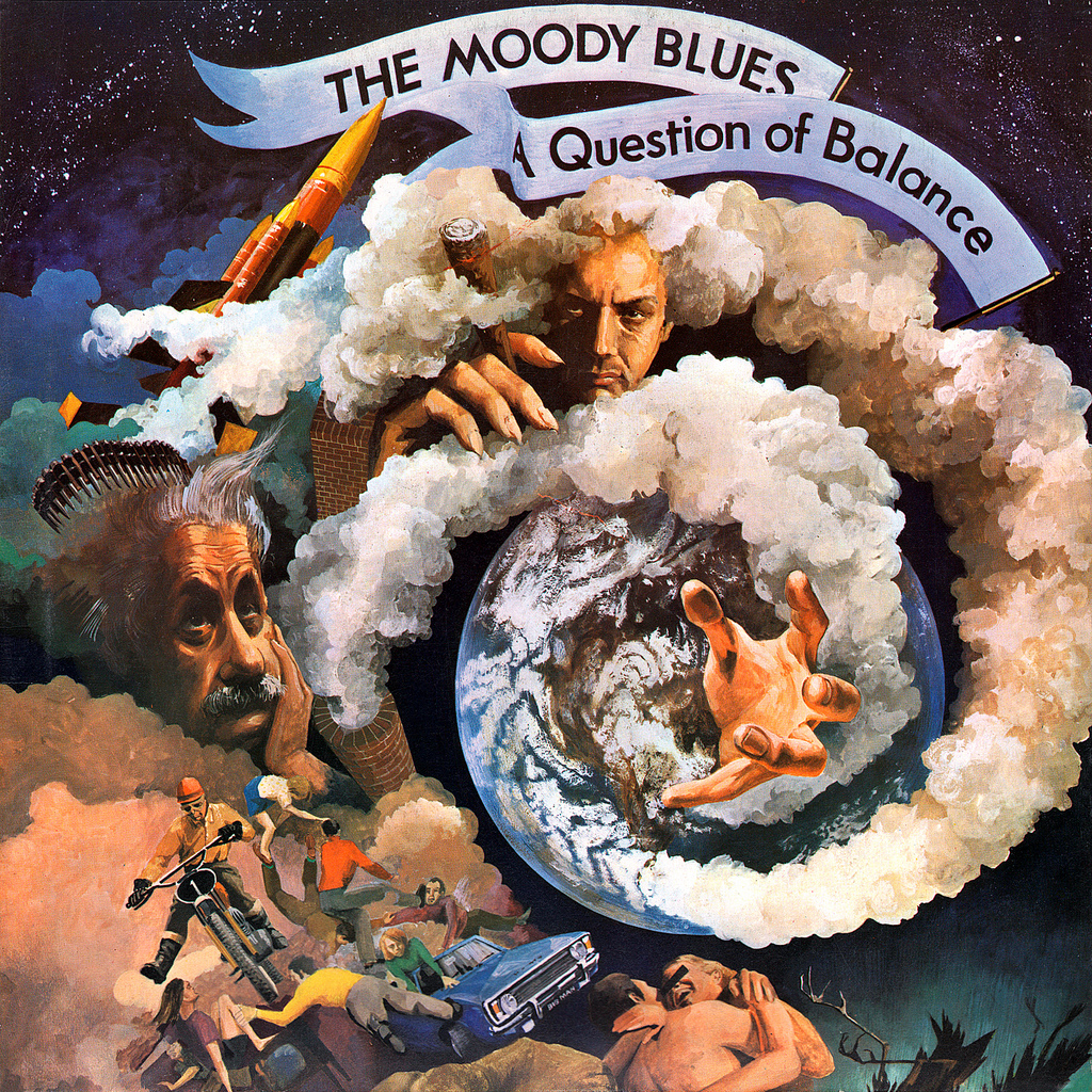
A Question Of Balance
Band: The Moody BluesAlbum Artist: Phil Travers
Year: 1970
Genre: Progressive Rock, Folk Rock
Phil Travers continued his design relationship with The Moody Blues with the cover art for “A Question Of Balance”. As with the other covers, Travers would illustrate while listening to the music. The design contains multiple swirling images, most notably a reference to Albert Einstein, the scientific progress, spirituality (God reaching out with his left hand), and satire of spirituality (God holding a smoking cigar with the other).
This cover initially stirred controversy for including an image of a man holding a gun. The art was based on an actual person, but he was not happy with the depiction. To quell the objections, Travers altered the imagery to include a pith helmet. When the album was later released on CD, the image appeared as originally intended.

Pyramid
Band: The Alan Parsons ProjectAlbum Artist: Hipgnosis
Year: 1978
Genre: Progressive Rock, Art Rock, Symphonic Rock, New Wave.
At the time the album's inception, there was renewed interest in Egyptian culture, and in particular, and the Pyramids of Giza. The Alan Parsons Project wanted to express this fascination through their music. Pyramids were believed to harbor great power, and the cover art was meant to portray this internal fascination. The cover art was created by the design group, “Hipgnosis,” which existed from 1968 to 1982. Hipgnosis consisted of Storm Thorgerson, Aubrey Powell, and Peter Christopherson, and they specialized in album art, logos, and other promotional materials for rock musicians. The company name came from Adrian Haggard, who scratched the word on Storm and Aubrey’s front door late one night. In 1982, the artists formed a new business called “Greenback Films” which specialized in music videos.

Mind Games
Band: John LennonAlbum Artist: John Lennon
Year: 1973
Genre: Rock
John Lennon designed and created the cover for “Mind Games” using a collage style approach with pieces of his own photography. Yoko Ono's profile appears as a distant mountain range that Lennon is emerging from. It was meant to represent Yoko's powerful influence on him as an artist and romantic partner. Lennon recorded this album during his 18 month separation from Ono due to his U.S. Immigration difficulties. Both the front and back covers are similar except for whether John’s position appears in the foreground of the mountain or the background.

Axis: Bold As Love
Band: The Jimi Hendrix ExperienceAlbum Artist: Roger Law, Karl Ferris
Year: 1967
Genre: Psychedelic Rock, Pop Rock
The cover art for “Axis: Bold As Love” was illustrated by Roger Law. It depicted Jimi Hendrix and his band as different forms of Vishnu. A portrait of Hendrix, taken by Karl Ferris, was integrated into the final design. When presented with the art, Hendrix was dismayed at the choice of Vishnu, stating that Native American imagery would have been more appropriate because of his heritage. Despite this, the cover art was used, and Hendrix would celebrate his Native American heritage in posters and international television appearances.

Weird Scenes Inside The Gold Mine
Band: The DoorsAlbum Artist: Bill Hoffman
Year: 1972
Genre: Psychedelic Rock, Acid Rock, Blues Rock, Hard Rock.
“Weird Scenes Inside The Gold Mine” was the second compilation album for The Doors, and the first to be released after Jim Morrison's death in January 1972. The album title comes from the song, “The End,” and the cover was designed by Bill Hoffman under the art direction of Robert Heimall, who has been a active designer and director since the 1960’s. The press, once highly critical of Jim Morrison for pushing the limits of decency, began to celebrate his fearless, often reckless, individualism as an artist. The cover painting is meant to suggest his image was the subject of perception, and the only true identify of any individual is within their own mind. The Gold tones suggest his exceptionalism, and the compilation album was thought to be his musical eulogy.

Toys In The Attic
Band: AerosmithAlbum Artist: Ingrid Haenke
Year: 1975
Genre: Hard Rock, Blues Rock, Heavy Metal
The art concept for “Toys In The Attic” came from Steven Tyler. He originally wanted a teddy bear with his wrist cut, and stuffing spilling out all over the floor. However, following a discussion with the illustrator, Ingrid Haekne, Steven Tyler and Joe Perry decided the attic should be filled with toys, instead. Haekne was best known for fashion design and storybook illustrations, and her artistic influence is evident in the cover's final design.

From The Mars Hotel
Band: The Grateful DeadAlbum Artist: Alton Kelley, Stanley Mouse
Year: 1974
Genre: Acid Rock, Jam Rock, Psychedelic Rock, Blues Rock, Folk Rock
“From The Mars Hotel” cover art was created by Kelley/Mouse, who previously designed the covers for “American Beauty,” “Grateful Dead,” and “Europe ’72.” Alton Kelley, specifically, is credited for the 'Skull and Crossbones' design synonymous with The Grateful Dead. “From The Mars Hotel” features a depiction of an actual building in San Francisco juxtaposed against an extraterrestrial landscape. The actual building was a hotel “flophouse” and temporary residence of Jack Kerouac, and used as the location shot for David Bowie's 1972 promotional film, “The Jean Genie.” The reference to Mars refers to the otherworldly atmosphere created by those that gathered at the Hotel. This hotel was eventually demolished during the Yerba Buena redevelopment, and footage of the demolition can be seen in “The Grateful Dead Movie” released in 1977. It is now the location of the Moscone West Exhibition Hall.
Saturday, April 8, 2017
Assignment 12: Games as a Medium
 |
| "Whisper And Mantra" by Natalie Palumbo |
One of my favorite games from childhood is the Super Nintendo game “Secret Of Mana,” also known as Seiken Densetsu 2 in the Japanese release. When I was very young, I would watch my older brother (who has low-verbal autism) play this game for hours. It was the first time I witnessed expansive storytelling through a game, and we both loved the music. The main characters were given official names in later iOS releases. However, in the early SNES port, you could input any name you wanted for all three main characters. I would beg my brother to type “Natalie” as the girl character (later known as “Primm.”) Only six typed characters were allowed, so my name was entered as “NATTIE.” This ended up sticking with me as a nickname.
A major feature of this game is the sound effects and the original soundtrack. One of my favorite songs entitled “Into The Thick Of It” actually pushes the sound quality on the Super Nintendo to the limit bordering on more realistic sound and emotionally driven melodies. The composer, Hikori Kikuta, had only composed soundtracks for three games, including Secret of Mana. While he never had any formal musical training, his influences came from movie scores and orchestral soundtracks. From time to time, I will listen to the soundtrack from “Secret of Mana” while I'm working and missing my brother.
Randi meets a traveling knight named Jema. The knight encourages him to re-energize the sword by visiting the Mana Temples. Randi meets Primm (a magical healer) and Popoi (A Mana sprite abandoned with no memory of his family), and they all decide to go on the quest together. (Sprites live through the existence of Mana.) The Emperor starts pursuing the young travelers because of the potential power of the Mana Sword. The main antagonist is an ancient sorcerer named Thanatos who is manipulating the Emperor and his followers. Thanatos claims he wants to create a “new peaceful world”. The sorcerer's body is deteriorating, so he wants a young body to possess and continue his hunt for the Mana Fortress. He captures a boy named Dyluck, and a girl named Phanna, and plans to possess Dyluck for his final quest.
The Empire unsealed all eight Mana Seeds for Thanatos who promised them “peace” for their effort. However, Thanatos betrays and murders them so he can seize control of the Mana Fortress for his own power. Randi, Primm, and Popoi locate the Mana Tree to re-energize the sword, which is the focal point of the world’s life energy. Thanatos, who anticipates their arrival, positions the Mana Fortress over the tree and destroys it. The charred remains of the tree speaks to the three heroes to warn them that a giant dragon, known as the Mana Beast, will be summoned to combat the fortress. Despite the good intentions of the dragon, the tree warns it has little control over its rage, and is likely destroy the world while destroying the fortress. The tree reveals she was once the wife of Serin, the original Mana Knight, and he was Randi’s father. She further reveals that she was the disembodied voice guiding Randi at the waterfall.
The three heroes travel to the Mana Fortress to confront Thanatos, who is attempting to transfer his mind into Dyluck. With his last burst of energy, Dyluck warns that Thanatos sold his soul to the underworld, and is restricted from gaining control of the Fortress. Dyluck then commits suicide, which forces Thanatos to take the form of a skeletal lich. The three heroes defeat this form when Mana Beast arrives to attack the Mana Fortress. Randi is apprehensive about killing the beast because if the Mana are dispersed, Popoi (being a sprite who exists through Mana), will disappear. Despite this, Popoi encourages Randi to slay the beast with full energy from the Mana Sword. The Dragon explodes and transforms into snow, and Popoi is transformed into a spirit. At the end of the game, Randi places the Mana Sword back in it’s original location beneath the Potos Waterfall.
One of the most interesting aspects of this game is the complexity of the attack system and items used for battle. The functions were designed for players to customize gameplay. Even though I was too young to appreciate the design complexities, I was still able to enjoy the game visuals, characters, story, music, and the animated elements. While I never got around to completing the game (since I preferred to watch my brother play while I did my schoolwork), I sincerely consider “Secret of Mana” one of my artistic influences. Being low-verbal with autism, my brother and I still bond over things we loved as children. The soundtrack alone takes me right back to my childhood. I hear the music and I'm little again sitting happily on the couch next to my big brother watching him play.
Sunday, April 2, 2017
Assignment 11: Long Form Television
I chose to watch the series “Sherlock,” which is a modern day interpretation by Steven Moffat and Mark Gatiss. Detective Sherlock Holmes is played by Benedict Cumberbatch, and his partner, John Watson, is played by Martin Freeman. The series starts with Watson returning to 221 Baker Street following Military service in Afghanistan with the Royal Army Medical Corps. He is introduced to Sherlock Holmes, who is a highly intelligent but emotionally cold individual. The local police are initially suspicious of the socially quirky detective, but eventually grow to respect Holmes and his acute awareness of finite details and crime solving ability.
As the series evolves, we see the relationship dynamic between Holmes and Watson. The 'practical' Watson is periodically frustrated with Holmes for his emotionally detached behavior. His frustration is tempered by Sherlock's ability to piece together seemingly unrelated information successfully. Given that observation, Watson channels his energy on the innocent victims of crime, and Sherlock's ability to help them.
Holmes, on the other hand, seem oblivious to the external frustrations felt by the people around him. He is unmoved by the police and their annoyance that he ignores typical protocol. Sherlock does not mean to be disrespect those in charge of criminal investigations, but innately knows the fine details will aid police in the long run, and can't be bothered with arbitrary rules. Sherlock's character portrayal is consistent with traditional portrayals from the past, including speech, despite the stories taking place in modern day London. All the other characters are modernized and speak in a contemporary fashion, short of using trendy speech or slang terminology.
In the series, we are introduced to new characters, like Sherlock's brother, Mycroft. Sherlock has a tempestuous relationship with his brother given their enduring sibling rivalry and quest to better the other in matters of intelligence. Mycroft is played by co-creator, Mark Gatiss, and is the more socially aware of the two brothers. Their rivalry is more a battle of wits than adversarial.
Jim Moriarty, played by Andrew Scott, is a nemesis to Sherlock Holmes. Moriarty is initially introduced through character dialogue. He kidnaps and poisons two innocent children. After the children are rescued, the investigators notice the children's fearful reaction to Holmes. This leads the investigators to believe that whoever kidnapped the children disguised themselves as Holmes in an effort to frame him. By this time, the relationship with the police and Holmes is well established, and Sherlock's reputation for solving crimes is rooted in his devotion to defend the innocent. Jim Moriarty, is later revealed, along with his determination to destroy Holmes and remove him as a crime solving obstacle.
As adaptations go, I love the modern day depiction of Holmes as an eccentric genius, and Watson as the equally intelligent, yet frustrated, 'every-man'. This makes the characters more relatable, and allows humor to be injected into the stories. Past adaptations portray Holmes as above criticism (as he was the only one leading investigations), and Watson was merely a supportive sidekick. While that is the more traditional approach, it leaves the characters one dimensional. I feel this modern portrayal is more emotionally layered. While audience members can watch episodes separately, the series has an overarching story-line involving criminal associations with Moriarty. Some of the episodes have mini arcs spanning through two or three episodes, or end on a series cliffhanger.
Those being introduced to the Sherlock Holmes series for the first time may want to start from the beginning to best understand the dynamic between main characters. Even those unfamiliar with the original Sherlock Holmes can be entertained by the fresh portrayal of the current iteration being shown on Amazon Video. Overall, this modernized Sherlock Holmes is worth viewing for the clever storytelling, character development, overall attention to detail, and beautiful cinematography.
Saturday, March 25, 2017
Assignment 10: Reading the Multimodal Narrative
Persepolis by Marjane Satrapi.
Persepolis is a dialogue heavy autobiographical graphic novel about the main character's evolution from a child to an adult living in Iran during the 1980's. Marjane witnesses the drastic change from a more democratic environment to an oppressive dictatorship. Among some of her recollections, Marjane recounts the hostility for simple pleasures like certain articles of clothing, music, alcohol, parties, and other everyday things most people take for granted. Recreational forms of entertainment and socializing were deemed “decadent,” and were forbidden. As social oppression grew, the progressive views of her family affected her perspective of the political landscape. Not only do you see Marjane mature from a child to a teenager, you see the evolution of her attitudes towards religion and politics. The main character is based on Satrapi herself, so the dialogue feels as if she is engaging the reader directly in real time.
The graphic art style is simple in terms of character design and color. The characters are simplified in a semi-cartoon fashion, but visually have emotional weight because of the high contrast black and white giving each scene intensity. There are humorous moments, but the majority of content is poignant and ominous given the emotional evolution of the main character. The detail and shape is reminiscent of Russian nesting dolls. Color-wise, the graphics resemble the pop art styling of Andy Warhol with high contrasts between light and dark tones.
As for the layout, each little moment is given a smaller box for that particular action or piece of information. This is to create a sense of movement within the still imagery, and to convey continuous action so the story feels fluid. This graphic novel would serve well as storyboards for an animated adaptation.
As an artist, Satrapi definitely has an Auteur’s Voice. Her graphic novel is unique and insightful, and her perspective is engaging and sympathetic throughout. The art style matched the sobering mood of her story perfectly. Most graphic novels use color to hold the reader’s attention, but the high contrast black and white matched the serious tone of a young woman trading her idealism for realism perfectly. It's as if the reader is watching a historical documentary. I would highly recommend this graphic novel to anyone looking for strong imagery coupled with fascinating and heartbreaking stories told authentically from an author’s perspective.
Subscribe to:
Posts (Atom)